Saturday, 30 October 2010

Blog set topic: crossroads II

            I am very ambitious. Yet from what side of the creative field do I see the world? Currently I have choice, I can do anything I want to and this aspect of freedom is something I find exciting. Deciding to narrow my pathway and specialise is something I find daunting and difficult. My struggle in clarity to choose one area over another is due to enjoying 3 of the 4  rotations and furthermore, in my opinion producing successful projects in visual communication, 3d spatial and fashion and textiles. Therefore in the coming assesment dispite the area talks I am still torn in what to choose.
            Upon entering the course I was unsure of what degree I was going to choose, even if I was going to do something art based or not. Yet I know now I want to do an art based degree- the excitement and opportunities which each area offers is never the less overwhelming.
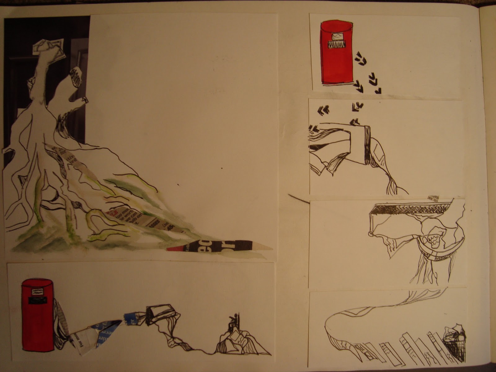
            At A-level I was always told to stick to one idea, and not to play with too many at one time and this I found limiting as I am constantly coming up with new ideas amidst the bombardment of visual imagery, adverts, and social interaction within the world today. Hence visual communication was almost like therapy, just churning out ideas.           
            My most successful area I feel was visual communication- it gave me the opportunity to generate lots of ideas and experiment which I loved and contrary to my expectations it was not all computer based and was fast paced, which I liked. I was also introduced to photo manipulation and generating lots of images which I had never done before and I found inspired new ideas. Producing lots of sketchbooks also proved successful and enjoyable.


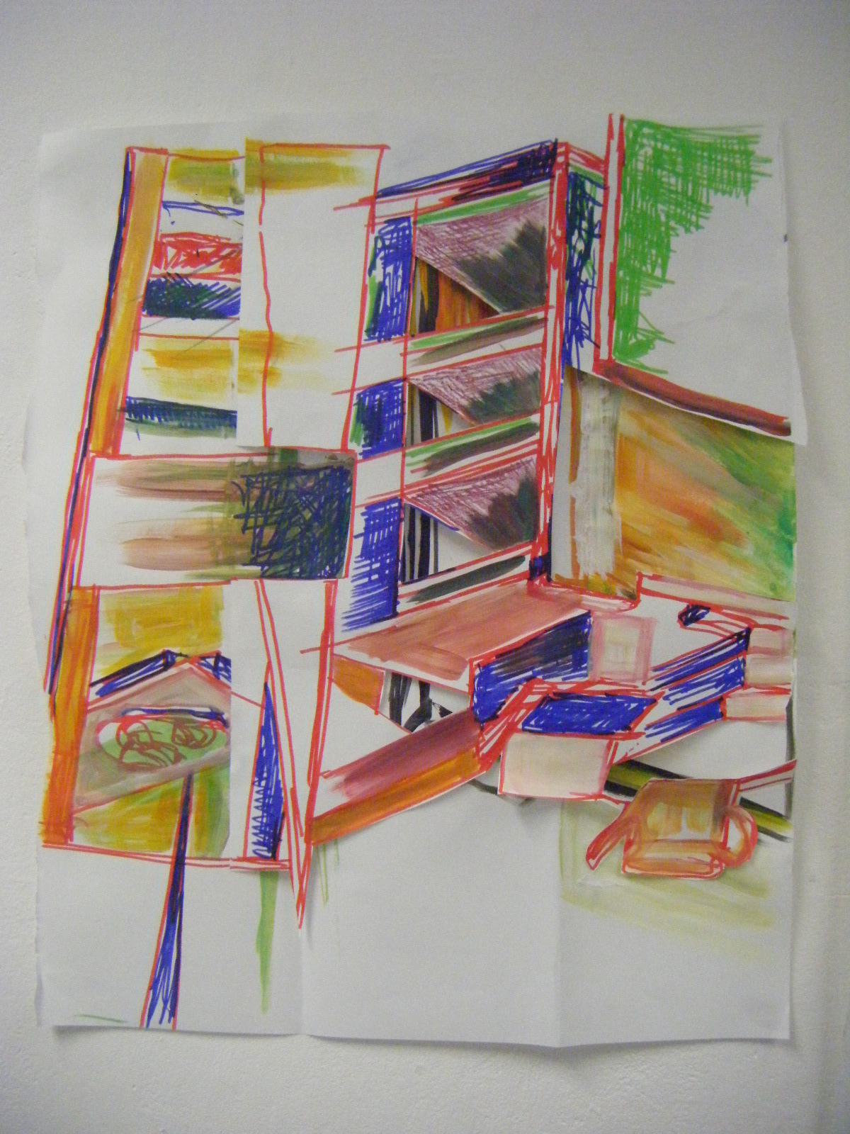
Within this area I felt the most creative. The brief was clear, I had a target and this more distinct direction compared to the other areas I found helpful. However despite this I am not confident using computers and even though I have been assured this is not a necessity for this area, I feel computer technology is the future, a vehicle and an essential tool to progress to the sort of success I crave. Tutors and students have suggested me to be an illustrator, yet although as is clear from my work I love to draw, I do not want to continue into a freelance environment, feeling around for money and direction. I feel I would be more successful in the competitive environment of advertising as, as others have commented on, my presentation skills.
            Another area which I have been considering is fashion and textiles- I enjoyed this rotation and its broadness, using lots of different media- yet I do not know where I would fit into this hugely competitive field. Ever since I was young I have always wanted to work within a fashion magazine, due to my interest in fashion through clothes and magazines. I see my role within this industry as advertisement, management and directing yet I do not know whether this ambition would suit the fashion and textile area. Upon entering the course I would have chosen this area, yet after the crit, compared to visual communication I question how successful I would be within this area.
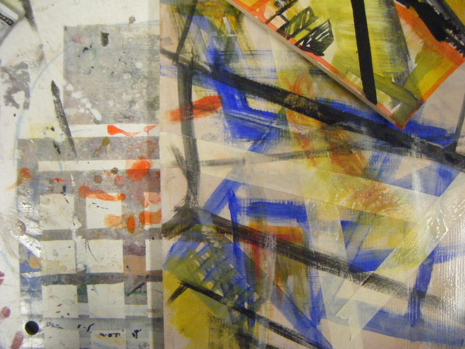
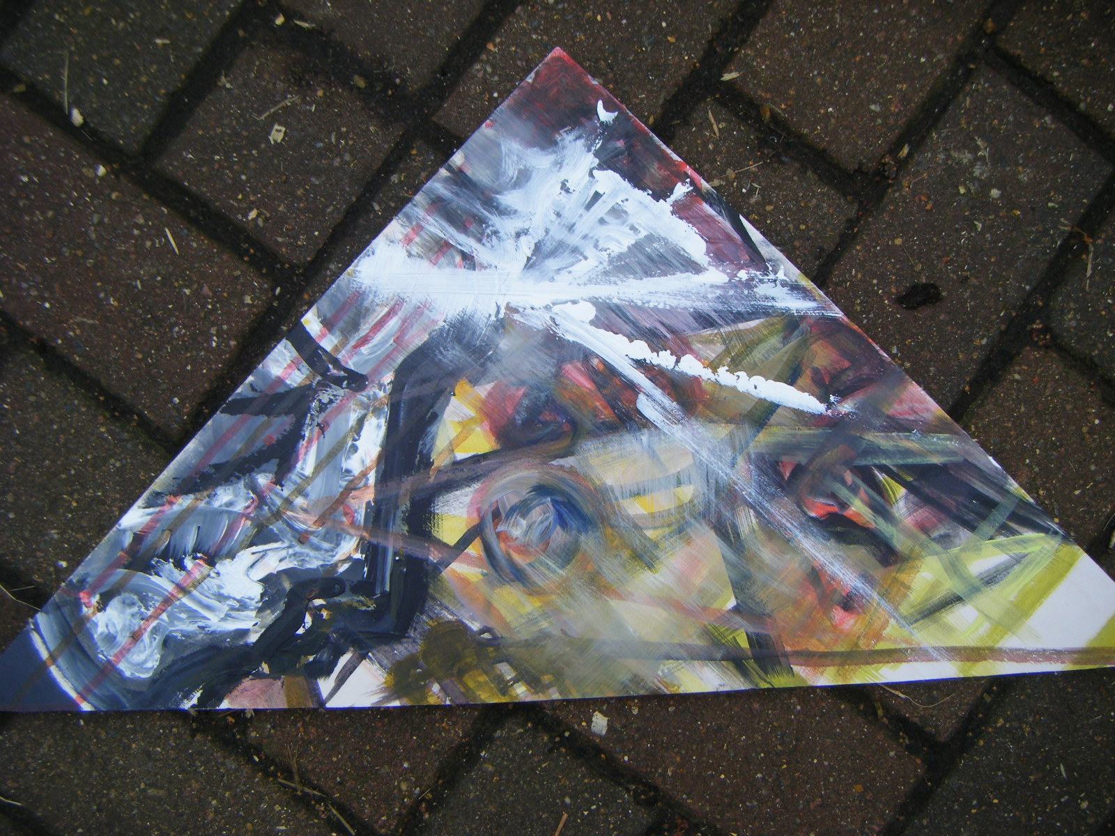
          My least favourite area was fine art- this was a drag, not only due to the vagueness of the project but the length and lack of direction, I need a clear brief to work with and I found this rotation although liberating, with a fat paint brush and large piece of paper, the work I produced in my opinion was unsuccessful, both aesthetically and in motivating me. I also found this area the most challenging in generating ideas and perhaps this reflects in my work.


                     From crits I have been told I am definitely a fine artist from my drawing, definitely an illustrator for the same reason, a jewellery designer for my use of colour and fondness of smaller scale within 3D, yet I have found this all confusing, I don’t fit into a clear mould. Therefore I hope the assessment with an outsider’s point of view will help concrete a decision between fashion and textiles and visual communication.
          At school I was hugely competitive both sporting and academically and I see art as a similar challenge which I hope to succeed in. I don’t feel my work implies that I am this, or I am that, and this is what I have found difficult in choosing an area to specialise in. People have liked my generation of work and ideas and although this is positive, this is what has made my decision hard.


Some fine art work


Some Fashion and textile work


Fine art

HATED this rotation!!!!!!!
For me it was too slow moving and lack of a clear brief for me made it difficult. Never the less over the first week I enjoyed the drawing, and on independent study day I found it great fun taking my own pictures around my local area and drawing the changes that occured. Yet what confused me about the area is what was good and what was bad!!! In the past I have found when looking at other students work ither at school or in the other rotations, for me it has been clear what is 'good' and what is 'bad', not only in terms of ideas but aesthetically too. Yet within fineart, some of the more technical work was bad and the stuff that had taken two seconds and very little thought was good. This confused me as when it came to painting in the studio I found it difficult to know what was wanted from us, and moreover what would be seen as good and waht would be seen as bad! Hence for my final idea I came up with a selecition of several smaller paintings which would be hung together. These paintings were influenced not only by my confusion within the project but by some of my drawings, photo manipulations and too acetate work and the aspect of repitition. With inspiration I translated my ideas onto small pieces of wood. With this work I like the energy and I feel they are quite interesting with the many layers of paint. However these are not usually what I would count as a 'good' painting and although interesting I think I would have prefered to produce a more realistic piece against the advice of the tutors!!!!!!!!!!!!
Overall- rotation not good, it dragged on!!

Friday, 15 October 2010

Fashion and Textiles- Week 2

Firstly- The fashion textile room is TOOO cramped- to much ''stuff'' everywhere and it just makes everything sooooooo confusing. Abit like this week which I also found very confusing, not only in terms of what the brief was asking but what I was interested in. After much experimentation with the directed drawing and mini sketchbooks , using photo manipulation was something that seemed to work. My concept came from my initial experimentation with materials, I found that metal and shiny objects was something that I found interesting and especially when shiny objects contracted and expanded, hence I began to research and photograph everyday shiny objects that expanded and contracted. Taking this idea I decided to produce some fashion illustrations and enlarging some of my small sketchbooks and drawings which I had produced on both the directed drawing and also that I had done of shiny objects, I then used this to create patterns on the clothing, experimenting with blending and illustration.

Further to this I also produced some 3D accessories using my ideas from the previous week, however I feel that these were less successful as I didn't feel they showed what I wanted to show and also connect with my previous research very well.
Having had the crit I feel I can learn from this project,
- the need to have a breather in a visually dense book, incorporating simpler pages.
- I feel I have also learnt to experiment and take ideas further for example by photocopying my small books I was able to come up with the basis of my fashion illustrations.- basically go with instinct and try things out.

Overall I found the rotation different to what I had intially expected, alot more experimental and in a sense freeer than I had expected, with independence to do what you felt comfortable to do.

Saturday, 9 October 2010

Fashion and Textiles- Week 1

Initially at the start of the week we began drawing, different to 3D spacial, continuous line drawings, quick, blind etc. I didn't like this style, for me it was too messy, and didn't flow and the drawings were so quick it didn't give me a chance to think about what I was doing. Never the less it taught me about  positioning drawings onto the page and looking at their relationship to each other, moreover the speed of the drawings ment I got lots of work, in different styles and using different materails such as masking tape and looking at repitition which I found interesting.
Later on in the week I really liked producing the mini sketch books using different materials and looking at how you can layer the different materials, using different opacities, textures and stiching. I found this generated lots of different ideas about how the materials could work together. Therefore on Wednesday, unhappy with my large sketch book I ripped it apart and using ideas from the mini books I successfully reproduced it, layering and cutting out the drawings and positioning them with more thought than I had intially.
Overall I found the week interesting, although the style of the drawings was intially dawnting, having experimented through the week I am beginning to understand how different weights of material can work together which I feel will be important next week!!!

The Genius of British Art- BBC1

This programme I can quite honestly say- was not my cup of tea, never the less it gave me an incite into 16th century portraiture and in particular that of Henry V11. The programme talked of Holbine's portraiture of Henry V11 and how he used the paint and texture of the paint to reflect the personality of Henry V11. The programme also suggested how by simplifying the figure of Henry you could come up with a figure that was clearly Henry V11. I found this concept interesting, how a simple set of traingles could represent a specific person, it made me think of how you could incorporate this into other things such as simplifying architecture or interiors and how you could use this in advertising.

Fiona Banner- Tate Britain

The interplay between art and design is clearly visible when looking at her work, a piece of design, designed to kill with little aesthetic thought in mind being put into a gallery such as the Tate makes you see the work as a piece of art. When I initially saw the piece I was struck by the scale of the work, the angles, and the beauty of the piece. Yet after a quick coffee, coming back to look at the work it made me think- is it wrong to look at such a deadly piece of design as a beautiful piece of art??? Never the less upon seeing this work it also made me think of the idea of context, if one sees a plane like these in a war you do not see them as art,  you see them in a negative way and generally the mood they portray is that of sincerity and coldness. Yet when one views them within the Tate Britain the mood is warmer, within the confines of the magnificent Tate building and moreover you see them as art and a fascinating piece of work- perhaps even admiring their presence and historical value. In conclusion seeing this work it makes you think, and upon looking round at the rest of the audience within the gallery it definately got a reaction and I think that this is what Banner was going for!

Tuesday, 5 October 2010

Design real- Serpentine Gallery

With the bare room and objects hanging out of the context from where one would usually see them, it makes one think about the way we see things, and I feel that this exhibition really encourages you to appritiate design as works of art which I feel is important. I don't feel that for example the creative design of cars is always appritiated, we see them as design, they have a purpose, to get from A to B, they have facts ie mpg, 0-60 and this for many especially females is all one sees. This exhibition is provocative, making you think about design and I feel this is apt.

Design vs Art

Intially I thoguht the interplay was simple between the two ie like Capa suggests art is using a medium to change how you see the world, whereas design is changing how we live in the world. However having read the discussion by Joshua Porter I can see how the distinction between the two becomes some what blurry, with designed objects being at an art museum and the question then being posed is the object art or design. However having read the article I feel that the distinction is although blurred there is some vague clarity in so far as a designer creates soemthing with a market in mind, ie to sell. Whereas a artist when creating true art creates it without a market in mind, the work is simply created. Thus if a painter creates work for a buyer they are hence designing and if a designer is simply creating a piece they are an artist.

Rachael Whiteread- Tate Britain

While her sculptures are often large-scale the drawings at the tate I feel provide a more personal, mobile counterpoint, although one might see them as preliminary sketches they are clearly works in themselves. I like how the works use texture and surface and begin to give an insight into how Whiteread thinks. For example Untitled (Double Mattress Yellow). This is painted on graph paper, and initially I thought it looked abit like a stale cracker. Yet upon closer examination you notice how the water colour socks into the papr and it begins to look like a stained mattress and thus perhaps a human trace. Yet what I found most interesting about this piece is how the ink traces bring the whole piece together, something I feel I will be able to incorporate into my own pieces, bringing a mixed media piece together.
On leaving the exhibition what I feel is essentail  to i my opinion the success of her drawings is how they appear almost ghostly, using different opacities she successfully leaves an almost human trace upon the pieces. This not only makes her drawings different and thus interesting but it also makes them personal and for me this is what I like about them, they are essentially documentation of how as a sculpturer, Whiteread sees things.

Final week- 3D Spatial

Having created the 3d maps in the studio and done some quick 5 minute drawings and further experimentation with line using different materials I produced some drawings based on 3D structures within the environment both around the studio, in Chelsea, Vauxall bridge and station and around the Tate Britain. When photographing and later sketching I was particularly attracted to the different angles the structures created and also the geometric shapes of the structures. When I later translated what I had seen in 3D to produce 2D drawings I initially found this difficult in trying to get the correct angles and look at how the different shapes within the environment locked in together. However on later sketches of these structures I began to understand the importance of tone and the clearer darker tones being closer and the other further away. This really helped me transform my drawings making the structures appear more 3D and not 2D. It aloud areas to stand out, improving my drawings.
In week 2 of the rotation I experimented further with making 3D structures inspired by the documentation of the week before and further 3D structures I created. Using simpler materials, smaller scale, and having been to 100% design for much needed inspiration I came up with, in my opinion, much better 3D objects than I had done in the previous week. Here I incorporated colour and energy which I had seen at 100% design and eventually came up with
Here I like the complexity and tension within the structure and I think all the different angles of the structure reflect my drawings and photographs well. However when given the brief to create a structure you can walk through- not a building, a structure to support the human body- not a chair and a structure to contain something small not a box, I found this structure difficult to work with in terms of scale. The colour and paperclips limited the scale that could be suggested in photographs. Then I, for a structure to walk through, simplified this initial structure and used white textured card. This immediately gave the impression that the structure was large and capable of a human walking through and the white worked really well with a plain white background.

Structure you can walk through
To create a structure to support the human body I immediately thought of the internal organs of the body and from the structures I had previously created and drawings of straight lines and angles I thought of the spine. I then looked at the various structures I had created and started to look at them in terms of spine like structures, putting them into linear patterns and then playing around with scale, photographing in various environments.


Structure to support the human body (Final Copy was vertical)
 Creating a structure to hold something small I found this the easiest of the three structures given my initial 3D structures and the materials I had used for these. Here I decided to try a different 3D structure and make something that locked together, creating a parcel like shape. Here I like how all the colours and lines interlock and also the complexity of the structure which I feel represents the different structures I have created. I found this difficult to show the scale of the structure when photographing it, as close up images gave the impression the structure was large and when the object was photographed from a distance it failed to show the complexity, layers and shapes I liked about the structure. Therefore I found that photographing the structure within my hand was the best way of demonstrating scale.
Structure to hold something small

During the spatial 3D rotation I have enjoyed it, the first week more than the second as I enjoyed the drawing and quick speed of the first week, whereas I have found the second week rather slow moving!