Aware: art fashion identity..... Great, really good exhibtiion that I would thoroughly recommend. It was different to what I had expected it was about how contemporary artists and designers use clothing as a mechanism to communicate and reveal elements of ones identity. Upon entering I was greeted by a dress so intimately made yet it was only temporary , treated with a bacteria it decayed over time and therefore somewhat reminded me of a life cyle, the clothes age like us. It was interesting to see the photographs before and after- quite wierd how bacteria had affected the presentation of the clothing. Alot of the work seemed to have an architectural basis and a piece which was particularly stricking was a tinsel dress , here the leather was meant to represent the skin- it was stunning. Katerina Seda linked clothing with communication and social relationships and this was also a common theme in some of the pieces. Yet here resisdents did not interact with their neiioghbours in a new housing estate and therefore to help communications Seda made t- shirts with photos of all the houses form her estate and a telephone number on them of the sender to the newer estate- this I thought was quite a fun idea. Gillian Wearings work was also here, her 60 min silence 1996 showed police men posing for a group photo, yet they were waiting in the same position for one hour. Over time it becomes evident the dynamics of the group as some of the policemen start to fidget which somewhat decreases the authority of their uniforms and for me made them seem much less powerful- it was suprisingly quite compelling to watch.
Having been here with my Gran- I was persuaded to go upstairs to see the Glasgow Boys exhibtion. Although this type of traditional painting is not my cup of tea- this did not take away from just how beautiful some of the paintings were- complete contrast from the previous exhibition in every sense from work, to people, to atmosphere. If you were at the RA go to it- but perhaps as a graphic designer, don't go out of your way to see it unless you are with your Gran!
Wednesday, 29 December 2010
Sunday, 26 December 2010


Wednesday, 15 December 2010


Reverting to type exhibition- Coronet street
An exhibition of contemporary letterpress practitioners. Here I liked the combination of both computer based letter press, and also tradtional ways. Having done the typography project I think this made me see the work of the exhibition differently, I was looking at the gaps between words, the angles, why they used specific colours, how the artists used hyerachy. I think having worked on typography this made me appritiate and understand the concepts behind some of the work better, walking round.... I felt like a typographer!!!! The exhibition also gave me ideas on how type can interact differently and how you can use space to highlight a message.


It was also pretty cool to see the Chelsea work above -'excuses' which I had seen in the studio as a work in progress.
Saturday, 11 December 2010
Okay Chelsea talk...
''nowdays when people can't be rockstars, they want to be graphic designers''
Geoff Thomas-Shaw
''Don't be a graphic designer if you don't like glamour''
Geoff Thomas-Shaw
'Graphic design is everything'
Wendy
and this amonst students work.... fridays party with 1st year graphics and seeing what they thought of the course.. what students are doing upon graduating.. and just the course structure and environment - heart now set on Chelsea
NASSA- ''failure is not an option''.
Dad- ''want something, work hard and you will get it'' okay yes that is sooooo cheesy and I apologize, but its true, nothing comes from nothing.

Book arts shop- start of book arts project
Ok... so new project - making 3 books decided to go back to the book arts shop 4 abit of innnnspiration. And after the first visit which lets just say was less than successfull I found it pretty useful- although the size of it again should be bigger. Not sure which books to do yet- can see how alot of them can be linked but think it will be important to link the text really well to the structure in order for the whole thing to make sense and not be too random. Also think I will try to create 3 different sorts of books ie one maybe shown in photographs as may be temporary and thus destroyed or moved and then .. i don't know. Thought maybe a rubber with the text written in layers inside then it is quite therapeutic as getting rid of things you don't want- could be with a piece of paper with permanent writting of things you cant get rid of... i don't know! But form the library talk I think perhaps start with simple ideas and make them well. A good book i have been looking at is ''1000 graphic elements by Wilson Harvey''- not directly on books but some good inspiration on structures with information.
In the environment continued....


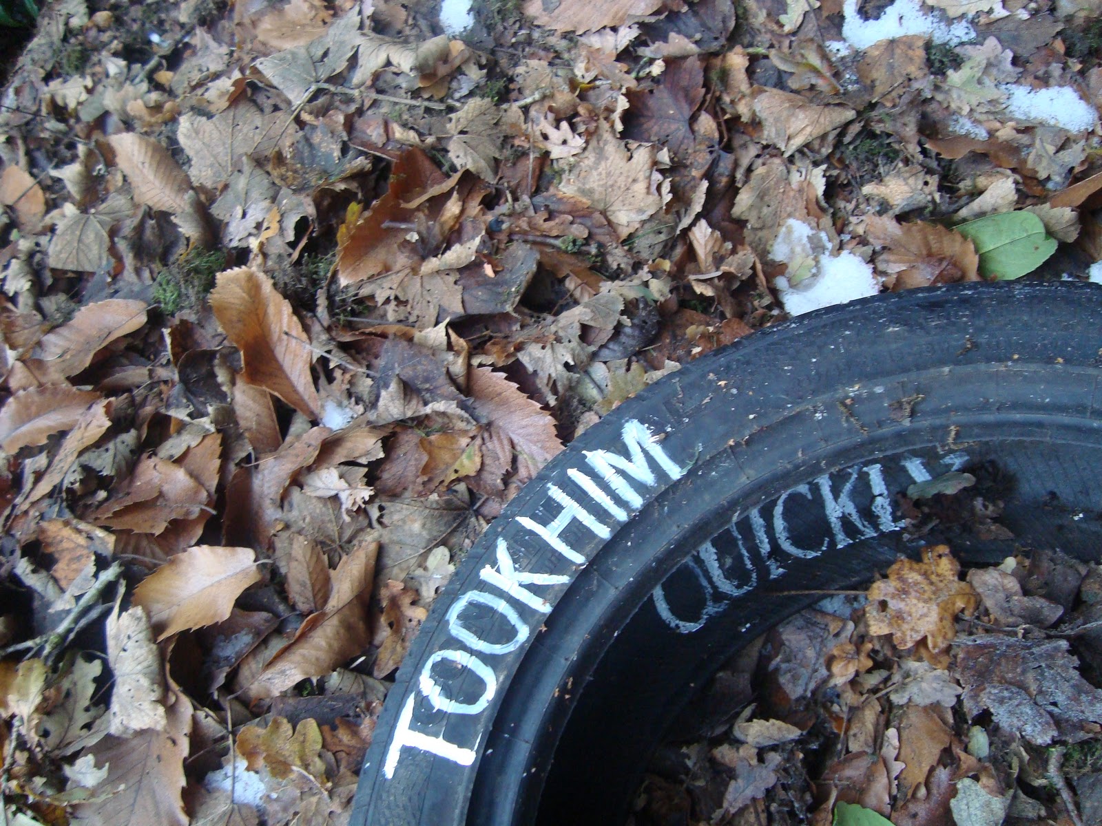
I also thought 'took him quickly' could be a drug or a drink taking someones life ither quickly through an overdose or quickly making them hooked- taking away the real person. Here I like how the liquid distorts the writing- perhaps suggesting how the drink distorts and ruins the persons life.
Another idea was that of a wheel- a car can take someones life- or can take someone quickly to a destination. I thought it rather ironic that the tyre was in the woods and thus clearly not taking anyone quickly which I like.
Typography project


Monday, 6 December 2010
typography research
 |
| Laszlo Maholy- Nagy |

 |
Herb Lubalin |
 |
| Bradbury Thompson |
 |
| Kurt Schwitters |
 |
| Stephan Sagmeister |
 |
| El Lissitzky |
 |
Laszlo Maholy- Nagy |
 |
| Saul Bass |
 |
| Neville Brody Having researched these typographers it made me think abit more abour not only placement but scales of the different fonts within the composition and how the sentances were going to read, before I had underestimated the powerfull the placement can have. Also frorm the research I have decided that for my sentances I want them to be black and white with perhaps a bit of grey scale, simply because I don't think that the colour is as powerfull and the type as appritiated in colour- there is no need for colour! |
Wednesday, 1 December 2010
Typography project
Ok.. after mondays long intro and tuesday which was more intro, I felt this topic would be as long as the beginning of the week! Wrong, yes.. actually quite enjoy it- takes fricking for ever and is abit repetitive- yet actually quite alright- and although what seemed like a waste of time on tuesday morning- now pretty glad we had it- 100 pieces was perhaps not going to happen without the long bla bla that was the beginning of the week!!
So bring on ''WHATEVER TOOK HIM THEN TOOK HIM QUIETLY''!!!
So bring on ''WHATEVER TOOK HIM THEN TOOK HIM QUIETLY''!!!
Lists
First real project within the area...... Initially I was pretty pleased with how browd the project was, I could think of so many things to put in the list options. I was able to fill a sketchbook with ideas, and although this gave me alot to work with, I then found selection tricky. Granted I would rather have to much to work with than too little , but selection within this project I feel was the trickiest bit. Yet afeter drafting several ideas and taking phtographs I feel I still had 2 strong list ideas that could work, one was 10 objects that were the wrong colour- here I worked with the concept that if some everyday objects were a different colour then they wouldn't need to be cleaned. For example a toilet if it was brown would not need to be cleaned as often, a plate if it had a red mark on it for ketchup wouldn;t need to be cleaned, if tables had drinks marks on them already you wouldn't need a coaster. This idea I liked yet having taken photographs I was struggling in the physicalities of producing it, ie what media to use and not being as confident on photoshop meant this was not really an option and hence physically chucking paint on for example the toilet although seemed not only a great idea but great fun, under the time restraintes I knew I would be unable to source not onl this but the rest of the objects needed! Having spoken to several people in the class about my ideas it was suggested I did another list- 10 things that make you grin. As aweful as this sounds I found lots of things that made my grin- not smile but grin ie a sneaky kind of- I shouldn't be grinning things. For example when you get the last piece of pizza, you go YESSSS and have a sneaky grin that its yours! Another example is when you get the last car parking space in a busy car park, you just get it, park, and have a sneaky grin to yourself- YESS! This is the concept I decided to work with and after discussions about presenting it ie photographs presented in car parking spaces, illustrating the work and how I was going to deliver the concept of YEEEESSSS to the viewer, I decided to just hold up the letters, Y, E and S,using phtography, yes it is simple but I felt the work needed this in order for people to understand it! Here are some examples...


Turner Prize
This, one of the biggest art prizes in the world with lets just say global publicity, I was hence quite excited to see the show. Not only is there controversy behind the prize every year, from people jumping on Tracy Emins bed, to poo being put on the steps of the tate and undoubtedly controversy within the papers Yet there is also a sense of British pride I feel, surrounding the show. This sense of pride may only be from art goers, yet never the less, from the fancy roman and greek style temple that is the Tate Britain which hosts the Turner prize exhibtion, to the numerous celebrities presenting the prizes, this I thought was a show that could not be missed. However walking in although I saw great contrast of work from Hans Hacker to Jasper Johns work I left the show suprisingly uninspired, I found the work difficult to understand and put my money on who I thought would win and moreover suggest who I wanted to win! Yet after finding out abit more about the work- Angela De La Cruz to win! I feel her work is not only conceptually sound but aesthetically sound and too skillfully made- it is also very different to just another painting- although Susan Philipz sound piece proved interesting and too would be very intersting in different places, the way it was displayed within the exhibition did not appeal and therefore I would not choose it to win! Sooo... Angela De La Cruz to WIN!
Friday, 12 November 2010
Visual communication- CHOSEN
This week has been great, not only abit of a break but I have found the vis com project fun to do- although now with a few of the 30 things left to do I have found I have left the hardest ones till last and they are proving somewhat difficult, yet I think a modern approach of minimalism could well be the answer!!
Today I went to the Woolff gallery and saw Clay Sinclair's work- I feel this complimented the project- it was fun and his ideas made you chuckle! Personally my favourite of his work was 'beautiful people', his work was young, modern and refreshing- making you smile which I think is important when looking at art. Yet the humour also appealed to different ages as I went with my mother and she too saw the funny side of the works- wanting to buy the 'real men' for my dad yet at a couple of thousand pounds although this work was great- perhaps this won't be his christmas present!!! But walking away this exhibition although small was definately worth a visit- and although this is soooooooo cheesy the colour and humour did brighten up the day having got literally soaked at the station.
After going to this exhibition I went to the 'bookshop' which honestly was crap!! Firstly couldn't find the place, secondly it was pouring with rain and lastly it was tiny! Walking around what seemed like a box with a little women staring at me- really wasn't worth the visit! Saying this there were some intersting mini sketch books ( although I could have probably created something similar myself), and it was on the list of 30 things to do!
So... 26 done, 4 more to go!!!
Saturday, 30 October 2010
Blog set topic: crossroads II
I am very ambitious. Yet from what side of the creative field do I see the world? Currently I have choice, I can do anything I want to and this aspect of freedom is something I find exciting. Deciding to narrow my pathway and specialise is something I find daunting and difficult. My struggle in clarity to choose one area over another is due to enjoying 3 of the 4 rotations and furthermore, in my opinion producing successful projects in visual communication, 3d spatial and fashion and textiles. Therefore in the coming assesment dispite the area talks I am still torn in what to choose.
Upon entering the course I was unsure of what degree I was going to choose, even if I was going to do something art based or not. Yet I know now I want to do an art based degree- the excitement and opportunities which each area offers is never the less overwhelming.
At A-level I was always told to stick to one idea, and not to play with too many at one time and this I found limiting as I am constantly coming up with new ideas amidst the bombardment of visual imagery, adverts, and social interaction within the world today. Hence visual communication was almost like therapy, just churning out ideas.
My most successful area I feel was visual communication- it gave me the opportunity to generate lots of ideas and experiment which I loved and contrary to my expectations it was not all computer based and was fast paced, which I liked. I was also introduced to photo manipulation and generating lots of images which I had never done before and I found inspired new ideas. Producing lots of sketchbooks also proved successful and enjoyable.


Within this area I felt the most creative. The brief was clear, I had a target and this more distinct direction compared to the other areas I found helpful. However despite this I am not confident using computers and even though I have been assured this is not a necessity for this area, I feel computer technology is the future, a vehicle and an essential tool to progress to the sort of success I crave. Tutors and students have suggested me to be an illustrator, yet although as is clear from my work I love to draw, I do not want to continue into a freelance environment, feeling around for money and direction. I feel I would be more successful in the competitive environment of advertising as, as others have commented on, my presentation skills.
Another area which I have been considering is fashion and textiles- I enjoyed this rotation and its broadness, using lots of different media- yet I do not know where I would fit into this hugely competitive field. Ever since I was young I have always wanted to work within a fashion magazine, due to my interest in fashion through clothes and magazines. I see my role within this industry as advertisement, management and directing yet I do not know whether this ambition would suit the fashion and textile area. Upon entering the course I would have chosen this area, yet after the crit, compared to visual communication I question how successful I would be within this area.
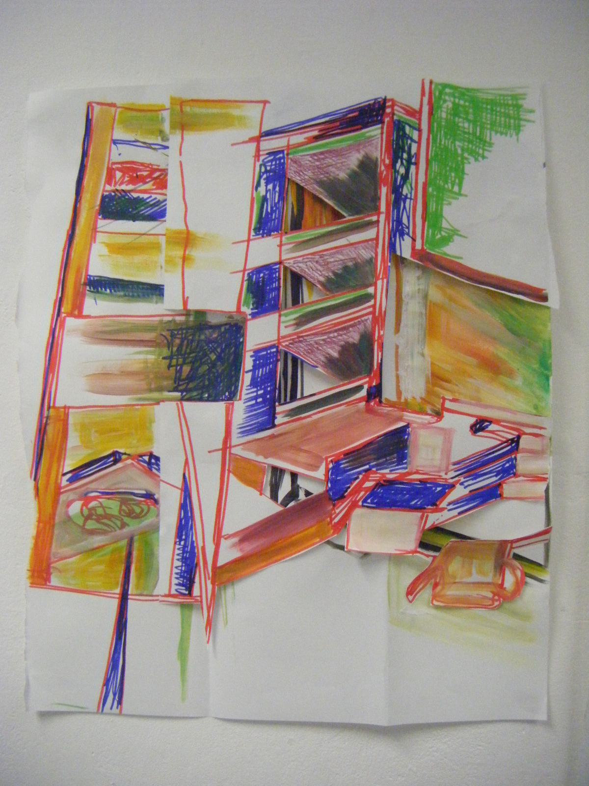
My least favourite area was fine art- this was a drag, not only due to the vagueness of the project but the length and lack of direction, I need a clear brief to work with and I found this rotation although liberating, with a fat paint brush and large piece of paper, the work I produced in my opinion was unsuccessful, both aesthetically and in motivating me. I also found this area the most challenging in generating ideas and perhaps this reflects in my work.
My least favourite area was fine art- this was a drag, not only due to the vagueness of the project but the length and lack of direction, I need a clear brief to work with and I found this rotation although liberating, with a fat paint brush and large piece of paper, the work I produced in my opinion was unsuccessful, both aesthetically and in motivating me. I also found this area the most challenging in generating ideas and perhaps this reflects in my work.


Subscribe to:
Comments (Atom)